anchorThe problem with the trailing quote
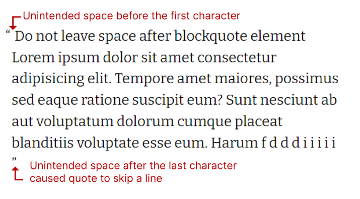
What we know: it is not floating, or hanging on its own, it is simply an after text. It must be set as inline, to make sure it does not skip a line by accident, if it has no space left (see photo). Which means, it has no layout. We cannot increase the size by other than font-size.
PS. I tried numerous ways to display it inline-block with other combinations, there is no guarantee the quotation mark will stick to the last word, it might skip a line any moment.
Watch out for the nasty white space added by HTML before the first character when using text indentation, and after the last character. It is by definition of HTML if we add pseudo elements with content, it will consider the tabs added in HTML as a collapsed space character. So our HTML should always be collapsed like this:
<blockquote>lorem ipsum</blockquote>
<!--Avoid this in HTML-->
<blockquote>
Lorem ipsum
</blockquote>
<!--remove tab space, or do it in JS-->
<!--Or add ​ before first letter-->
<blockquote>
​Lorem ipsum</blockquote>
<!--I found no solution for the last character, tab space must be avoided-->Adding a ​ before the first character removes the extra unintended indentation, but the last character, if the closing tag is on the new line, the quote might skip a line.

For the purpose of this quick testing tool, I would rather write simple JavaScript to trim out the spaces, given that the above is such a nasty hack, and very unlikely to occur in code generated dynamically.
// In real left dynamic code, make sure to trim, and place on one line
`<blockquote>${ value.trim(' ') }</blockquote>`;

// for our testing tool we'll just do this
document.querySelectorAll('blockquote').forEach((blockquote) => {
	// trim spaces
	blockquote.innerHTML = blockquote.innerHTML.trim(' ');
});anchorTrailing font-size
When text indentation method is used, the leading quote line-height is always aligned with the trailing quote line-height, they push each other in unity. That makes it a winning point for this method. Nudgin the variables, it becomes clear that the most painful aspect for the trailing quote font size in the positioning method is the vertical alignment. Adding to the tool:
/*control the vertical alignment*/
.classic blockquote:before {
	vertical-align: var(--leading-vertical-align, unset);
}
.classic blockquote:after {
	vertical-align: var(--trailing-vertical-align, unset);
}
Before we jump into possible solutions let's move on with a few other challenges.
anchorVanity
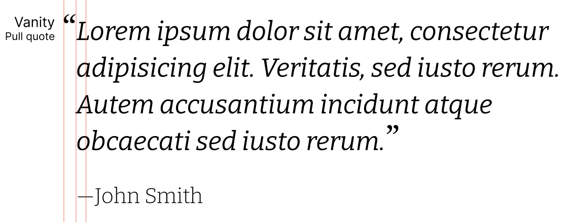
Or pull quotes if you wish to be procedural. The difference from the above is the negative hanging indentation of the leading quotation mark, and the much larger font. Adding the basics to the test tool with a toggle button, reusing the --leading-indent variable.
.makevanity blockquote {
	font-size: 150%;
	font-style: italic;
	margin-left: 0 !important;
	padding-left: 0 !important;
}

.makevanity blockquote:before,
.makevanity blockquote:after {
	font-style: normal;
}

.makevanity blockquote:before {
  /*make it hang*/
	margin-left: calc(var(--leading-indent, 1rem) * -1);
}
The aspiration is to get to the following:

The last challenge to add to the mix is choosing a different font.
anchorChoosing a different font
I use Bitter. I like Bitter, but I do not like the quotation marks that come with it. This might be an anti-pattern, nevertheless, I will attempt to choose a different font for the sake of science!
Playing with different options on Figma and Google fonts, I chose a couple that go well with Bitter. Literata or Newsreader. (I tried my best to choose fonts similar in line heights, I also went for variable fonts.)
The download URL from google fonts initially looks like this
https://fonts.googleapis.com/css2?family=Bitter:ital,wght@0,300..700;1,300..700&family=Literata:wght@400;700&display=swap
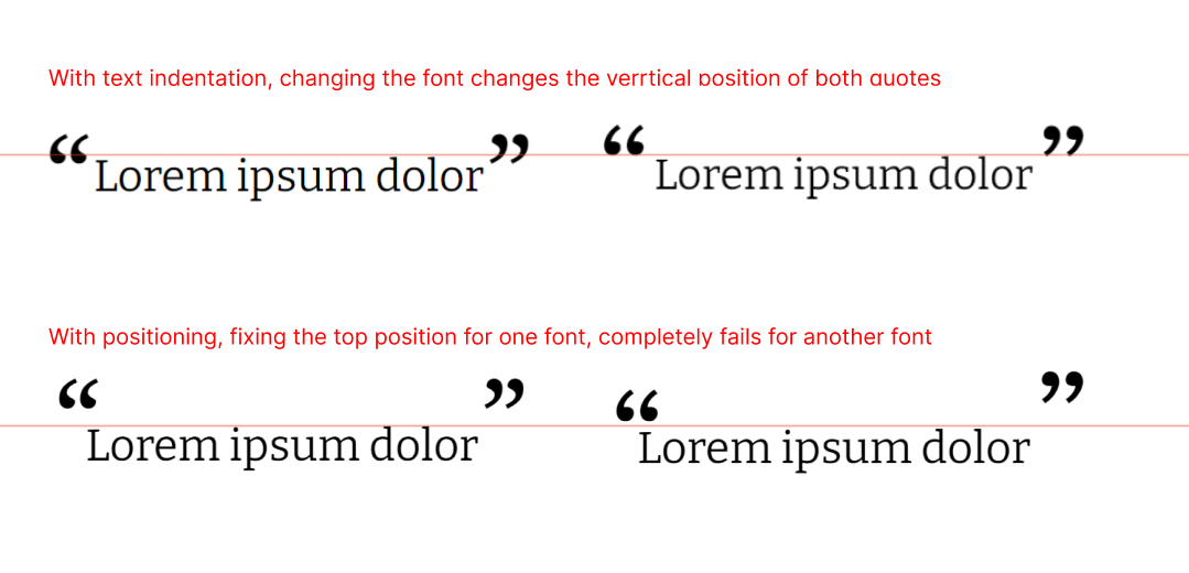
The problem with having a different font—for no other reason than art—is that every font defines the size differently. A quick test for those fonts revealed that:
The font chosen affects the vertical alignment of the quotation marks at inconsistent rates, which needs fine tuning, other aspects were not dramatically affected by font change.

Because we are not using any other characters, let's change the download link to have text with only quotation marks, and the em-dash (for citation).
For text:
https://fonts.googleapis.com/css2?family=Bitter:ital,wght@0,300..700;1,300..700&display=swap
For quotation marks:
https://fonts.googleapis.com/css2?family=Literata:wght@400;700&text=“”‘’—&display=swap
And let's add the font to the tool:
.classic blockquote:before,
.classic blockquote:after {
	font-family: var(--font-family, inherit);
}anchorCitation and inline quotes
Adding inline quote definitions is easy and straightforward. Citation should be preceded by an em-dash, which looks better in Literata, but let's not get carried away with fonts, we'll just use the same font. In a project of my own, I would create a new font of the preferred quotation marks and dashes. I would use ico-moon for that. But that is a different Tuesday.
q:before {
	content: '\2018';
	font-family: var(--font-family, inherit);
}

q:after {
	content: '\2019';
	font-family: var(--font-family, inherit);
}

/*citation */
cite {
	display: inline-block;
	margin-top: 1rem;
	font-style: italic;
}
cite:before {
	content: '\2014';
	font-family: var(--font-family, inherit);;
}
/*push to align with blockquote*/
.classic cite {
	margin-left: var(--leading-indent, 1rem);
}

.makevanity cite {
	margin-left: 0;
	/*the citation text should not be enlarged, just a bit is enough*/
	font-size: 120%;
	font-style: normal;
}
Coming up next, I will put the tool for good use. We will make a final conclusion: which method is best, and is the perfect blockquote really possible?
Our variables thus far:
:root {
	--line-height: 1.5;
	--font-size: 100%;
	--leading-line-height: unset;
	--trailing-line-height: unset;
	--leading-vertical-align: unset;
	--trailing-vertical-align: unset;
	--leading-indent: 1rem;
	--leading-left: 0;
	--leading-top: 0;
	--scale: 1;
	--leading-vorigin: unset;
	--leading-horigin: unset;
	--font-family: inherit;
}
I also have a use case, and a final CSS to include in my next project.

Here is the link to the blockquote testing tool.