I have been creating HTML for the past … I stopped counting at 20, years. Everything changes, except one stubborn element that refuses to budge. The blockquote.
anchorWhat makes it perfect?
First, let's define perfect. In our case, it is not just creating the right padding and margins, because that is the lazy way out. But here is the minimum to make it perfect in my book:
- Has the right open and close quotation marks
- Sits well with one line, or multiple lines
- Quotation marks added via CSS
- Adapts to increased font-size
- Added left margins, or hanging margins when it’s a pull quote
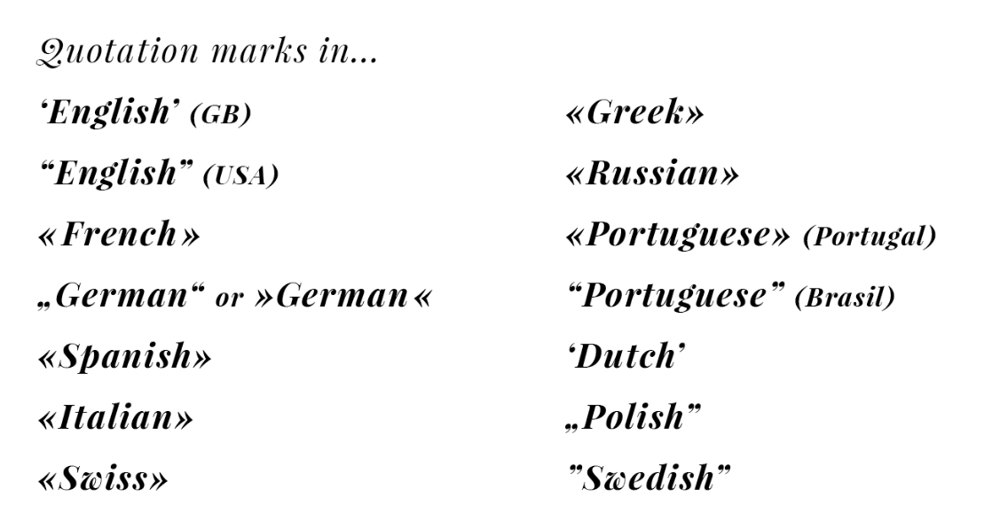
Putting aside the cultural differences and focusing on the English one, let's dig.

anchorThe lazy blockquote
The simplest form of a blockquote is what came to be the default in a lot of apps within the last 5 years, the bordered paragraph:

<blockquote class="plain">
	Lorem ipsum dolor sit amet consectetur adipisicing elit. Ea blanditiis delectus magnam accusamus, quasi quae labore veniam officia illum, necessitatibus pariatur eveniet vitae exercitationem quidem dolore sequi iste temporibus molestiae?
</blockquote>

<style>
blockquote.plain {
  font-weight: 400;
  font-style: italic;
  border-left: 3px solid rgba(0,0,0,.84);
  padding-left: 20px;
  margin-left: -23px;
  padding-bottom: 2px;
}

</style>
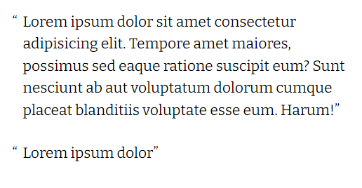
But I'm moving on to a smart quotes option. The idea output I am looking for is the following:

anchorThe opening and closing quotes
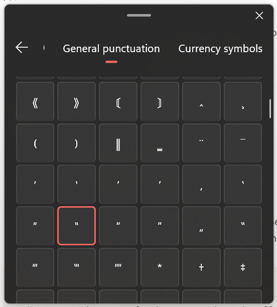
Turns out the opening and closing quotes are not as straightforward characters as a keyboard punch. Especially on windows. Best way to find them is look for them under (windows+.) list, under symbols > General punctuation group.

There are two solutions for the leading quotation mark:
- Add left margins to the paragraph, and negative indentation for quotation mark
- Add left paddings to the paragraph, and absolutely position the quotation mark
To determine the moving parts that create a blockquote, I will write a tool to customize each property needed, for the different solutions. As I move on, I will register all my findings, to demystify the blockquote dilemma.
The plan is to test the following:
- Solution with text indentation
- Solution with absolute positioning
- Increase the size by font-size
- Increase the size by transform: scale
- Change the font family of quotes
First, setup:
Setup: adding the pseudo elements
Semantically, the cite tag cannot be placed inside blockquote, so we will simply wrap both in a div, and style it. Let's start with the classic blockquote.
<style>
/*We areg going to style these to produce the effect we want*/
  .classic blockquote {
    /*reset*/
    margin: 0;
  }
  .classic blockquote:before {
    content: '\201C';
  }
  .classic blockquote:after {
    content: '\201D';
  }
  .classic cite {
    display: block;
  }
  .classic cite:before {
    /*mdash*/
    content: '\2014';
  }
</style>

<div class="classic">
	<blockquote>Lorem ipsum dolor sit amet consectetur adipisicing elit. Facere accusamus dolor, corrupti voluptates, officiis, id aspernatur quis expedita nulla repellat cupiditate architecto delectus? Nihil vero laboreut, ipsa blanditiis distinctio.</blockquote>
	<cite>John Smith</cite>
</div>
Testing tool
Find the tool I quickly coded on StackBlitz.
This tool allows me to nudge all possible factors, until I find the one I want to use for my project. The deciding factor is how little fine-tuning css can be done to create the effect.
anchorSolutions
Let's get on with the different solutions to add the artistic elements, of hanging the left quotation mark, enlarging its size, and changing its font.
anchorText indentation
.classic blockquote {
  /*make the quotation mark hang*/
	margin-left: 1rem;
}
.classic blockquote:before {
	/* this is required for props to pick up */
	display: inline-block;
	/*same amount ans margin-left*/
	text-indent: -1rem;
}
The amount of margin-left added, is the same amount of text-indent subtracted. That goes into our tool:
/*add margins, subtract indentation */
.classic blockquote {
	margin-left: var(--leading-indent, 1rem);
}

.classic blockquote:before {
	text-indent: calc(var(--leading-indent, 1rem) * -1);
	display: inline-block;
}
anchorPositioning
.classic blockquote {
  position: relative;
	padding-left: 1rem;
}
.classic blockquote:before {
	position: absolute;
	left: 0;
	top: 0;
}
Absolutely-positioning the leading quote, makes it independent of text, thus does not obey the line-height or margin. The padding-left is equal in effect to the indentation and margin of the above method. so we shall use the same variable. Even though the left position should be set to zero, let's add top and left as variables as well.
/* solution with position */
.classic blockquote {
	padding-left: var(--leading-indent, 1rem);
}
.classic blockquote:before {
	position: absolute;
	left: var(--leading-left, 0);
	top: var(--leading-top, 0);
}
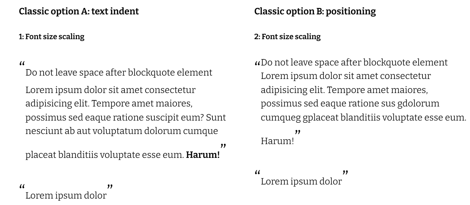
Both options work well. It looks the same on small font size. Let's push the size up. There are two ways to scale up for the leading quote: font size scaling, and transform scaling. As for the trailing quote, there can only be one way. Let's dig.
anchorFont scaling
If we are to scale the quotation marks slightly bigger than content for artistic results, it is attainable, but the further scaling goes, the faster it deteriorates, because font-size interferes badly with line-height.
For text indentation method, we can only scale by how much space given to us. At 150% scale, it looks good, it passes the test. At larger sizes, we need to tune in two values: text-indent and margin-left. Let's add the font-size as a factor.
/*control the font size of the quotations*/
.classic blockquote:before {
  font-size: var(--font-size, 150%);
}
.classic blockquote:after {
  font-size: var(--font-size, 150%);
}
Initially, looks like we can control the height by setting them to 1. Later as we test further, this is going to fail. Adding to the testing tool: line-height of text, of leading and trailing quotes.
.classic  {
  /*add line-height better for scaling and gives space for quotes*/
	line-height: var(--line-height, 1.5);
}
.classic blockquote:before {
	/*control the height*/
	line-height: var(--leading-line-height, unset);
}
.classic blockquote:after {
	/*control the height*/
  line-height: var(--trailing-line-height, unset);
}
Scaling the positioned quotation does not interfere with text, but it does not match the line height of the text or trailing quotation (it's sort of independent).
At 150% scale, it too looks good. On larger sizes, the leading quotation overlaps the text, which can be managed with the correct padding-left (set by variable --leading-indent).
In all cases, whenever we increase the size, we need to cater for so many factors, line heights, vertical alignment, margins and paddings.
Moving on to scaling with transform instead.
anchorScaling with transform
The other option is to transform. Here is an exaggerated scale to test with.
.classic blockquote:before {
	transform: scale(4);
	transform-origin: left top;

	/*also try: right and center*/
}
I can immediately tell that with indentation at larger sizes, it loses the grip of the left edge. The positioned one aligns to the left edge of the paragraph, and transformation origin is quite flexible, we can set it as percentages or pixels. Percentage setting however, requires a line-height of the quotation mark to be set higher than 0. We just have to remember that later, because as we use the tool, if they are not set together it might look irresponsive.
Origins shall go into the testing tool as well.
/*for scaling by transform instead of font-size*/
.classic blockquote:before {
	transform: scale(var(--scale, 1.5));
	transform-origin: var(--leading-horigin, unset) var(--leading-vorigin, unset);
}
Great, now the tool has all the moving parts, next we will look into the challenges and adapt.
Find the tool I quickly coded on StackBlitz, and hosted on Netlify. The tool is so straight forward, CoPilot wrote most of it.
Variables list so far:
:root {
  --line-height: 1.5;
  --font-size: 100%;
  --leading-line-height: unset;
  --trailing-line-height: unset;
  --leading-indent: 1rem;
  --leading-left: 0;
  --leading-top: 0;
  --scale: 1;
  --leading-vorigin: unset;
  --leading-horigin: unset;
}