Before I started working on user interface problems, I used to be a developer. Like many of the developers around the world, I was suffering from the UI-Virus (User Interface Virus).
anchorThe symptoms
The UI-Virus infects those who spend too much time looking at the code behind. Attempts to clean up the code with right tab indentation increases the chances of getting infected. If you suffer from any of the following symptoms, you are susceptible!
- You measure efficiency by how many hours you spend creating a new feature.
- Your understanding of high performance is the number of system clocks it takes the database to release information for the maximum number of users.
- Your text boxes are all of the same size!
- If you are a .NET developer, you love Datagrids. If you are not, you list data in a datagrid format!
- Your button captions are always: Submit.
- You have no sense of urgency towards Fieldsets.
- Your validation runs exclusively on server-side.
- You take pride in developing pages in the least time, and highest consistency. Which follows…
- Your understanding of consistency is bound to how identical the pages of an application are.
- List, View, Add, Edit, Delete, sisters of war, sounds familiar?
- For a “yes, no” option list, you use SELECT drop down menu.
anchorDeveloping symptoms
If you do not get help early on, these are additional symptoms you will develop
- You can’t stop looking at your very nice HTML code.
- You enjoy the number of colors used in your interface.
- Half the words on your interface are mistaken for links!
- BoldItalicUnderlined words don’t bother you.
- You end up with a stylesheet per page.
- You lose the sense of PADDINGS and MARGINS.
- All your pages look the same.
- All your apps look like Bootstrap.
anchorHELP!
We got you. Following are the ten commandments of UI: print them, hang them, ready them once before breakfast, and once before dinner, and you'll just be fine!
anchor1. THOU SHALT NOT DEPRECIATE
Don’t add a title to an area if the area is self-explanatory, it is like showing someone a stick and telling him: this is a stick! I know! Just hand me the stick! People learn fast, and get into habits of use. Make it an enjoyable experience. Sharpen the learning curve, the behavior you are implementing does not have to be standard, but you must stick to it throughout the application.
anchor2. THOU SHALT NOT DIVERGE
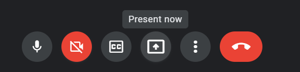
For the desktop application, use the default windows theme for buttons, they look great all ways. Google Meet's "present now." That's "share screen" by a smart-ass designer. Follow standards for as far as it takes you before you commit divergence.
anchor3. THOU SHALT NOT DECEIVE
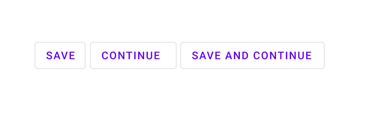
A button that says “continue” does not “save”, a button that says “save and continue” does. A button that says “Add People(…)” takes you some place to add people, a button that says “Add People” adds on the spot.
anchor4. THOU SHALT NOT NAG

Don’t repeat links on the same page, don’t repeat words, don’t ask too many times, don’t SHOUT, don’t go into too many details, and don't over-explain your mistakes.
Example: field label: countries, drop down first option: select country! What else would I be selecting?
Another example: error messages should be compact, straight and polite. Compare: Email required, versus: Please enter your email to be able to continue. You lost me at "please!". It's 2022 and the web is still full of nagging.
And of course: don’t bold-italic-underline a single word!
anchor5. THOU SHALT KILL!
Do not let technical issues (like restrictions in free content management portals) stop you from making killer interfaces.
anchor6. THOU SHALT RESPECT THY SHEETS
Want to apply style? Consult your CSS. Want a new style? Consult your designer. Never create a new class or add inline styles just to bring your page into style, you will break consistency, and one day you will regret it. Tailwind made this sin too easy to commit!
anchor7. THOU SHALT HONOR THY BROWSER
Honor the browser as given to you, use its capabilities and don’t enforce gimmicks against its limitations, try not to resolve its shortcomings, next version of the browser will resolve itself. The web app is not a desktop application, the browser is, and it belongs to the end user, not to your project manager.
Respect the browser’s scrollbar, and the back button, and avoid popups.
Form inputs of type “file” cannot be set by code; live with it!
anchor8. THOU SHALT NOT NEGLECT BILL son of GATES of UPPER LAND of MICROSOFT
Also known as: progressive enhancement.
anchor9. THOU SHALT NOT BRAG
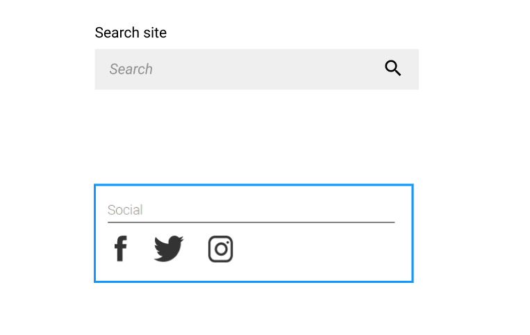
Don’t brag about your features by making a link to every little thingy on your site, like sub navigation and sub SUB navigation! Take the user inside to carry out what they want, not what your PM wants.
Respect users privacy, give warnings, then get out of their way. Remember, initially, your user hates your guts, don’t give him a reason to dump you. Roses are red, links are blue, or green, or fooshi… only links, not everything your PM wishes it to be.
WEAR-SUNSCREEN!" href="/posts/sunscreen#10.-THOU-SHALT-WEAR-SUNSCREEN! ">anchor10. THOU SHALT WEAR SUNSCREEN!
If you can’t, exercise! God knows I hate them both!