Google it, chances are, you too ran into this situation and had trouble with blending an image into a page background image. Most of the blending examples given, blend a layer image with the local background color, or image of the layer itself, ignoring any transparency. It does not blend into the page background. Also, chances are, you ran into the repugnant solution: absolutely position a pseudo element. Today, I tried out a few methods, and am sharing with you the only ones that worked.
The code pen of the solution:
anchorThe initial HTML
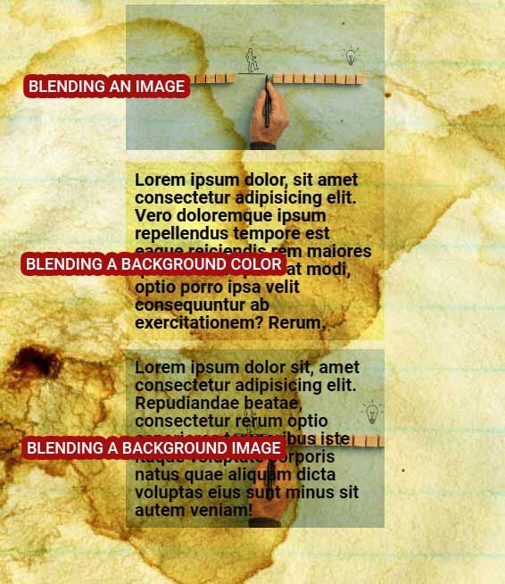
Let's begin with the basic HTML to generate three different effects: blending a foreground image, blending a background color, and blending a background image.
<div class="main">
	<div class="image-blend">
	  <!--Blending an image-->
		<img src="frontimage.jpg" alt="">
	</div>
	<div class="text-blend">
	  <!--Blending the background color-->
		Lorem ipsum dolor, sit amet consectetur adipisicing elit. Vero doloremque ipsum repellendus tempore est
		eaque reiciendis rem maiores quos minima placeat modi, optio porro ipsa velit consequuntur ab
		exercitationem? Rerum.
	</div>
	<div class="bg-image-blend">
	  <!--Blending the background image-->
		Lorem ipsum dolor sit, amet consectetur adipisicing elit. Repudiandae beatae, consectetur rerum optio
		asperiores temporibus iste itaque voluptate corporis natus quae aliquam dicta voluptas eius sunt minus
		sit autem veniam!
	</div>
</div>
The result, given a particularly high contrast background, is as follows:
anchorBlending a foreground image
That is the easiest part, since the image is an actual element, all we have to do is add mix-blend-mode
.image-blend  img {
  /*add blend mode directly*/
  mix-blend-mode: multiply;
}anchorBlend a background color
It gets harder. The initial temptation is to create a normal layer, with background color, then add backdrop-filter, or background-blend-mode. Niethe works. Looks like they both deal with the layer as an isolated element, and ignore the page background. Trying SVG filters using url, also failed, it blends the layer into its own local background. So finally, the solution, like everyone states on the web, is to have a pseudo element with background color, and apply mix-blend-mode.
.text-blend {
  /*make the container relative*/
  position: relative;
}
.text-blend:before {
  /*add background to a pseudo element as absolutely positioned layer*/
  content: "";
  display: block;

  position: absolute;
  top: 0;
  left: 0;
  right: 0;
  bottom: 0;

  /*add bg color, to reduce effect, reduce opacity*/
  background-color: rgb(125 120 17 / 39%);
  /*then simply add blend*/
  mix-blend-mode: color-burn;
}
A slight enhancement to that is to place the text inside another container, and make it relative, this way, the text inside is above the blend mode for sure.
<div class="text-blend">
  <!--Blending the background color-->
  <div>
	Lorem ipsum dolor, sit amet consectetur adipisicing elit. Vero doloremque ipsum repellendus tempore est
	eaque reiciendis rem maiores quos minima placeat modi, optio porro ipsa velit consequuntur ab
	exercitationem? Rerum.
	</div>
</div>
.text-blend div {
/*make the container relative to be above blending layer*/
position: relative;
}anchorBlend a background image
Failing to blend a simple background color with traditional methods, means blending background images will naturally fail, so we apply the same technique of a pseudo element. But pseudo elements cannot contain an image, we instead absolutely position an HTML image element. The container contains two elements, one for text, and the other is the image. The text must be positioned higher on the z axis, not to fall under the effect of the blend.
In HTML:
<div class="bg-image-blend">
  <!--add image element-->
  <img src="frontimage.jpg" alt="">
  <!--and text wrapper-->
  <div>
  	Lorem ipsum dolor sit, amet consectetur adipisicing elit. Repudiandae beatae, consectetur rerum optio
  	asperiores temporibus iste itaque voluptate corporis natus quae aliquam dicta voluptas eius sunt minus
  	sit autem veniam!
  </div>
</div>
And in CSS:
.bg-image-blend {
  /*container relative*/
  position: relative;
}
.bg-image-blend div {
  /*text container*/
  /*make it relative to increase its zindex*/
  position: relative;
}
.bg-image-blend img {
  /* add image as absolutely positioned layer*/
  position: absolute;
  top: 0;
  left: 0;
  width: 100%;
  height: 100%;
  /*make it cover the whole background*/
  object-fit: cover;

  /*make it blend*/
  mix-blend-mode: multiply;
  /*add extra filters for extra cool effects*/
  /*filter: sepia(1) saturate(0);*/
}anchorConclusion?
We still need PhotoShop. Sometimes!