Today we are going to dig into validating all field types. We begin with the simpler ones: the string-based ones:
- Email, tel, and text, are the easy ones; nothing that needs extra care
- Textarea: This is like text input. It may need extra styling.
- URL: This is not handled by Angular, so we can use a pattern matcher.
- Number: The browser number field is powerful enough to prevent non-numeric values, but we can still use a pattern matcher for more control.
Other types are:
- Select box: The only generic validation needed is
required - Checkboxes and radio buttons: The most obvious validation is "at least one is selected"
- Hidden fields: These are like text fields but need styling.
anchorTextarea
This one is straightforward, the common validation is minimum and maximum number of characters, which is done via the native minlength and maxlength . This has already been covered. Looks like the style is also still holding.

anchorSelect box
The pain—or not! Using the first test: a list with “required” validation, the only missing thing we can style is the arrow. It begins with appearance: none. But that's a project-related choice.
UX tip: if it is required, select one by default.
Some high-security websites (like banking) mandate that the user makes a deliberate choice—whatever that means—but those were the exact words I was once told. In this case, an option with empty value acts as a null value and will trigger an invalid flag.
<cr-input placeholder="Operating system">
  <select crinput id="os" formControlName="os" [required]="true">
    <option value="">Select</option>
    <option value="1">Windows</option>
    <option value="2">Mac</option>
    <option value="3">Linux</option>
    <option value="4">Android</option>
  </select>
</cr-input>
This is how it looks when invalid

This actually worked better than I hoped for! Let’s move on.
anchorCheckbox
For a single checkbox with required, functionally it works because it will be valid if true. But it looks awful. The label needs to be after the checkbox. Sucks doesn’t it?
// form component, the preferred syntax
template: `<cr-input placeholder="Terms and conditions" error="Please accept">
  <input type="checkbox" name="accept" [required]="true" crinput id="accept" formControlName="accept">
</cr-input>`

// ...
this.fg = this.fb.group({
	//...
	accept: [],
});
Won’t show you how it looks, we’ll fix all styles later. But it does work as expected.
anchorMultiple checkboxes
There are a lot of ways to create a group of checkboxes with the same name. This article is not about that, but the end result I want to reach is a validation message that falls into place with other fields.
The four ways I know of are:
formGroupNamewith checkboxesformArrayNamewith checkboxes- Checkboxes that update a validation state of the form
- Checkboxes that update a hidden input that is part of the form
Here is a example of formGroupName that uses a cross-form validation function to set the state of the form as invalid. We make use of the invalidForm property to display the error.
// form componennt
template: `
  <cr-input placeholder="Colors" error="At least one color" [invalidForm]="fg.get('colors').hasError('atleastOne')">
    <div formGroupName="colors">
      <label>
        <input type="checkbox" name="colors" id="color1" formControlName="red">
        Red
      </label> <br>
      <label>
        <input type="checkbox" name="colors" id="color2" formControlName="black">
        Black
      </label> <br>
      <label>
        <input type="checkbox" name="colors" id="color3" formControlName="green">
        Green
      </label> <br>
    </div>
    <ng-container helptext>Choose at least one </ng-container>
  </cr-input>`

// ...
this.fg = this.fb.group({
  colors: this.fb.group({
    red: [],
    black: [],
    green: [],
  }, { validators: this.atleastOne})

});

atleastOne = (control: AbstractControl): ValidationErrors | null => {
  // if all controls are false, return error
  const values = Object.values(control.value);
  if (values.some(v => v === true)) {
    return null;
  }
  return { atleastOne: true };

};
The error shows when:fg.get('colors').hasError('atleastOne')
It works, but it looks like the following. That, we’ll fix later.

We can also assign the directive to the formGroupName field, like this:
<cr-input placeholder="Colors" error="At least one color">
  // simply add crinput directive here
  <div formGroupName="colors" crinput>
    ...
  </div>
  <ng-container helptext>Choose at least one </ng-container>
</cr-input>
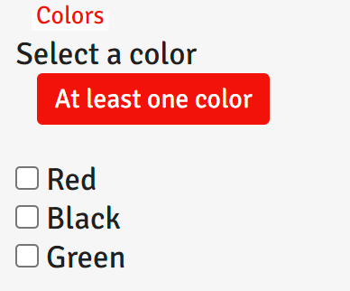
Keeping the validator as is, no need to use invalidForm. This validates nicely, and it looks as follows. A bit better.

Another way is to have the checkboxes separated in their own HTML element. This works as well if we want to display the bubble in a different location.
<cr-input placeholder="Colors" error="At least one color" [invalidForm]="fg.get('colors').hasError('atleastOne')">
	Select a color
</cr-input>

<div formGroupName="colors">
	<label>
	  <input type="checkbox" name="colors" id="color1" formControlName="red">
	  Red
	</label> <br>
	<label>
	  <input type="checkbox" name="colors" id="color2" formControlName="black">
	  Black
	</label> <br>
	<label>
	  <input type="checkbox" name="colors" id="color3" formControlName="green">
	  Green
	</label> <br>
</div>
And it looks like this:

This is all possible because we kept it dead simple with the form feedback error class. We just need a bit more touch-ups, every project may have its own styling.
anchorRadio button
As for radio buttons, they are bound to a single formControlName. The thing about radio buttons, is that the validation is almost always a cross-form validation. Best experience dictates that at least one should be checked by default. If none was checked by default, notice how by now we can use crinput directive on a normal HTML element, and get away with it. We use the invalidForm property to react to the invalid radio button.
<!-- add invalidForm to component -->
<cr-input placeholder="Gender" [invalidForm]="fg.get('gender').invalid">
  <!-- use crinpiut to div?! -->
  <div crinput>
    <input type="radio" name="gender" value="male" [required]="true"  id="male" formControlName="gender"> Male
    <input type="radio" name="gender" value="female" [required]="true" id="female" formControlName="gender"> Female
  </div>
</cr-input>
Looks as follows:

Let’s move on.
anchorHidden field
Hidden inputs simplify validation that would otherwise be challenging. They are mostly treated like text fields, with special styling. We will take care of that later.
anchorValidation common functions
We created a patterns collection to reuse throughout our project, but we can also create common validation functions for reuse. Let's go through some common examples to build it up. Next episode, inshallah. 😴
Did you know that UNRWA is complicit in genocide?