To understand the math behind css linear gradients, I will create a simple zigzag pattern on one edge. From mdn website, the composition illustration shows that every linear gradient line has a starting point, an ending point, and one angle.
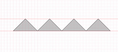
So in order to simulate complex patterns we need to break it down to the simplest gradient shape, then add them up together. The zigzag pattern can be broken down to a combination of two triangles, side to side, repeating in one direction.
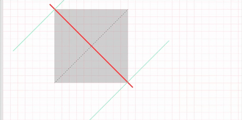
In Figma, I created the diagram of 200px square, to understand the effect of rotation. When rotated at -45 degrees, this is how it looks.
Now adding a color from bottom to top, at stop 100px, then transparent to top. Which is in effect, a rectangle of the bottom half of the square.
Now rotating the box into -45 degrees and tucking the base to the intersection point in its quadrant (as defined by MDN website), gives us the triangular shape we are looking for, which is 140px (isosceles). That is 70% of the original 200px of the square.
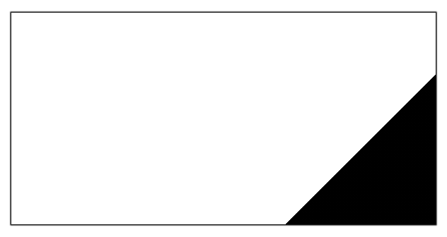
In VSCode that is a square of 200px, and linear gradient of -45deg, black at 100px, then transparent at 100px (this is in effect, an abrupt change in color, which creates the solid line).
.single {
	width: 200px;
	height: 200px;
	background-image: linear-gradient(-45deg, black 100px, transparent 100px);
}
Produces the 140px isosceles as promised. Increasing the width of the container does not affect the placement of the triangle it is always tucked on the right bottom corner.
Adding the second gradient at 45 degrees, produces the other triangle. Allowing both triangles to join to form the pattern unit, is by setting background-size to be twice of the length of the base. That is 280px.
.double {
  /* make wide */
  width: 100%;
  height: 200px;

  /* two triangles */
  background-image:
  linear-gradient(-45deg, black 100px, transparent 100px),
  linear-gradient(45deg, black 100px,transparent 100px);

  /* contain size to double 140px */
  background-size: 280px;

	/* tighten loose ends */
	background-position: bottom left;
	background-repeat: repeat-x;
}
Following video is to demonstrate, the effect of changing the angle on the triangle. As long as the angle is in the upper half of the circle (-90deg, 90deg), the opaque part of the zigzag is in the bottom half of the container.
Now let us organize this into CSS variables to reuse. The base unit, is the only variable that all other variables depend on, so I move that along with color to :root element.
:root {
  --zigzagbase: 200px;
	--color: black;
}
.zigzag-pattern {

	/* at 70% of size, set height of triangle */
	--zigzag-height: calc(var(--zigzagbase) * 0.7);

	/* gradient at half size stop */
	--zigzag-stop: calc(var(--zigzagbase) / 2);

	/* make background size double the height to create the pattern */
	--zigzag-size:calc(var(--zigzagbase) * 1.4);

	/* min-height to contain the zigzag at all times */
	min-height: var(--zigzag-height);

	background-image:
		linear-gradient(-45deg,
			var(--color) var(--zigzag-stop),
			transparent var(--zigzag-stop)),
		linear-gradient(45deg,
			var(--color) var(--zigzag-stop),
			transparent var(--zigzag-stop));

	background-size: var(--zigzag-size);
	background-position: bottom left;
	background-repeat: repeat-x;

}
Note: the color in this case, is not the background color of the container, but rather that background color of the wrapper behind the container. Since the zigzag is made of a solid color, and a transparent one. So if you choose the same color as the background color, there will be no patterns.
Here is the zigzag pattern on defined from top. The angles used, or in the lower half of the circle.
.fromtop {
	background-image:
		linear-gradient(-135deg,
			var(--color) var(--zigzag-stop),
			transparent var(--zigzag-stop)),
		linear-gradient(135deg,
			var(--color) var(--zigzag-stop),
			transparent var(--zigzag-stop));

}
For left or right zigzag, we need to swap the x and y axis. That is, background repeat, background position, and background size.
Note: the size is width and height, if one property is provided, height is assumed at 100%. So to swap, be explicit, then swap. The angles follow the same logic as above. Angles on the left half of the circle, produce zigzag pattern on the right side.
.onleft {
	/* swap x and y axis */
	background-size:  100% var(--zigzag-size);
	background-position: top right;
	background-repeat: repeat-y;

	/* angles on the right half of the circle */
	background-image:
		linear-gradient(-135deg,
			var(--color) var(--zigzag-stop),
			transparent var(--zigzag-stop)),
		linear-gradient(-45deg,
			var(--color) var(--zigzag-stop),
			transparent var(--zigzag-stop));

}
.onright {
	background-size:  100% var(--zigzag-size);
	background-position: top right;
	background-repeat: repeat-y;

	/* angles are on left half of the circle */
	background-image:
		linear-gradient(135deg,
			var(--color) var(--zigzag-stop),
			transparent var(--zigzag-stop)),
		linear-gradient(45deg,
			var(--color) var(--zigzag-stop),
			transparent var(--zigzag-stop));

}
To add both top and bottom, include all background linear gradients angles. And to have it left and right, swap axis.
.fromtwoends {
	/* include all four angles */
	background-image:
		linear-gradient(-45deg,
			var(--color) var(--zigzag-stop),
			transparent var(--zigzag-stop)),
		linear-gradient(45deg,
			var(--color) var(--zigzag-stop),
			transparent var(--zigzag-stop)),
		linear-gradient(-135deg,
			var(--color) var(--zigzag-stop),
			transparent var(--zigzag-stop)),
		linear-gradient(135deg,
			var(--color) var(--zigzag-stop),
			transparent var(--zigzag-stop));
}

.swapaxis {
	/* swap x and y axis */
	background-size: 100% var(--zigzag-size);
	background-position: top right;
	background-repeat: repeat-y;
}
So this is basically how linear gradients work when creating zigzag patterns. It really boils down to background size, minimum height, and angles of rotation.
Here it is in a Pen.